With mobile devices accounting for more than half of all global web traffic, making your WordPress website mobile-friendly is no longer optional — it’s a fundamental requirement for any site that wants to attract and retain visitors effectively. A website that delivers a poor experience on smartphones and tablets loses visitors almost immediately, with higher bounce rates, lower engagement, and ultimately fewer conversions.
In this guide, we’ll walk through the most effective strategies for transforming your WordPress website into a fully mobile-friendly experience — covering design, performance, navigation, and testing approaches.
Understanding What “Mobile-Friendly” Actually Means
A mobile-friendly website goes beyond simply fitting on a small screen. It means that all content is readable without zooming or horizontal scrolling, all interactive elements (buttons, links, form fields) are large enough and spaced well enough to tap accurately on a touchscreen, page loading is fast even on mobile data connections, images scale and display correctly at various screen widths, and the overall user experience feels natural and intuitive on a touch-based device — not like a desktop experience squeezed into a smaller container.
Step 1: Choose a Mobile-Responsive WordPress Theme
The most foundational step in making your WordPress site mobile-friendly is choosing a theme that’s built with responsive design principles. A responsive theme automatically adjusts its layout, typography, and element sizing to suit the screen width of the device viewing it — from a large desktop monitor to a smartphone held in portrait orientation. All modern, reputable WordPress themes are responsive by default. If you’re using an older theme that isn’t responsive, switching to a modern responsive theme should be your first priority.
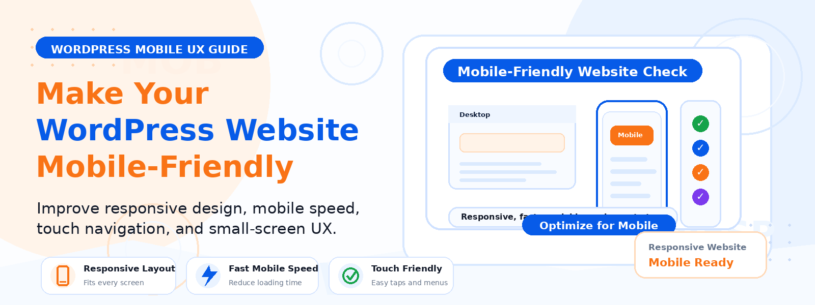
Step 2: Test Your Current Mobile Experience
Before making changes, assess your current mobile experience honestly. Use Google’s free Mobile-Friendly Test tool (search.google.com/test/mobile-friendly) to get an immediate assessment of whether Google considers your pages mobile-friendly. Open your site on actual mobile devices — an iPhone and an Android phone if possible — and navigate as a first-time visitor would. Note every point of friction: text that’s too small, buttons that are hard to tap, images that overflow the screen, or content that’s hidden or broken.
Step 3: Optimize Mobile Typography
Text readability is the foundation of mobile usability. Your body text should be at least 16px in size on mobile devices — anything smaller requires zooming and creates a frustrating reading experience. Ensure sufficient line height (1.5–1.7x font size) for comfortable reading of paragraph text. Use high contrast between text and background colors. Avoid using light gray text on white backgrounds, which is difficult to read in outdoor lighting conditions on a mobile screen.
Step 4: Optimize Images for Mobile
Large, unoptimized images are the leading cause of slow mobile page loading. Compress all images to the smallest reasonable file size, use modern formats like WebP for better compression, implement responsive images using the srcset HTML attribute so mobile devices download appropriately sized images rather than downloading full-resolution desktop images and scaling them down. Enable lazy loading for all images below the fold to reduce initial page load time on mobile.
Step 5: Improve Mobile Navigation
Navigation on mobile should be simple, intuitive, and accessible with one thumb. Use a hamburger menu (three-line icon) that reveals a clean slide-out or dropdown navigation panel. Ensure all navigation links are large enough to tap accurately and have adequate spacing between them. Simplify your navigation structure for mobile — if your desktop menu has dozens of items organized in complex dropdowns, consider creating a simplified mobile menu with only the most essential links.
Step 6: Optimize Touch Targets
Google recommends that all interactive elements (buttons, links, form inputs) have a touch target size of at least 48×48 CSS pixels to be reliably tappable on touchscreens. Small text links are particularly problematic — users frequently tap the wrong link or fail to register a tap on very small elements. Review all buttons and interactive elements across your site’s key pages and ensure they meet minimum touch target size requirements. Use your browser’s mobile inspector to check element sizes easily.
Step 7: Improve Mobile Page Speed
Mobile users are typically on slower, less reliable connections than desktop users, and they’re also more impatient. Google’s research shows that mobile bounce rates increase by 32% when page load time increases from 1 to 3 seconds. To improve mobile speed: enable a WordPress caching plugin, compress and optimize all images, defer non-critical JavaScript, minimize CSS and JavaScript files, and use a CDN to serve assets from locations close to your visitors. Aim for a Google PageSpeed Insights mobile score above 70, with 90+ as the target.
Step 8: Test Across Multiple Devices and Browsers
Mobile compatibility testing shouldn’t stop at one device. Test your website on at least two or three different smartphones with different screen sizes, running both iOS (Safari) and Android (Chrome) browsers. Different browsers render CSS differently, and what looks perfect in Chrome on Android may have issues in Safari on iPhone. Consider using a cross-browser testing service if you don’t have access to multiple physical devices.
Conclusion
Transforming your WordPress website into a genuinely mobile-friendly experience is a worthwhile investment that directly impacts your search rankings, visitor engagement, and conversion rates. Start with a responsive theme, address the most critical issues identified in your mobile testing, optimize images and typography, improve navigation, and continuously test as you make changes. A truly excellent mobile experience is increasingly a competitive differentiator in most industries — and the effort you invest in it will be rewarded by mobile visitors who stay, engage, and convert.