Your WordPress navigation menu is one of the most important elements of your entire website. It’s present on virtually every page, it’s typically the first interactive element visitors look for when they arrive, and it directly determines whether visitors can efficiently find what they’re looking for — or give up and leave. A well-structured, intuitive navigation menu reduces bounce rates, increases page depth per session, and improves your site’s overall user experience significantly.
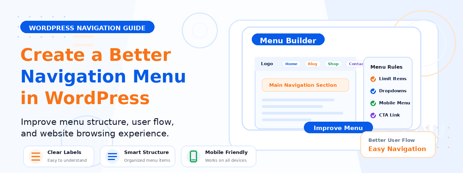
In this step-by-step guide, we’ll walk through how to enhance your WordPress navigation menu — from restructuring your information architecture to implementing practical improvements in the WordPress admin.
Why Navigation Matters for User Experience and SEO
Navigation affects your website in multiple interconnected ways. From a user experience perspective, it’s the primary tool visitors use to understand your site’s structure and find the content or products they’re looking for. Confusing or overly complex navigation leads to frustration and abandonment — particularly on mobile devices where screen space is limited. From an SEO perspective, your navigation structure creates important internal links that help search engines discover and crawl your pages. Pages linked from your main navigation typically receive the most internal link equity and are prioritized for indexing.
Step 1: Audit Your Current Navigation
Start by reviewing your current navigation menu with a critical eye. Write down every item in your menu and evaluate: Is this item important enough to deserve top-level navigation placement? Does the label clearly describe what visitors will find on the linked page? Is this item actually used by visitors? (Check your analytics data — Google Analytics or a visitor tracking plugin can show you which navigation links are most clicked.) Are there any items that create confusion or overlap with other menu items?
Step 2: Simplify Your Navigation Structure
The ideal main navigation menu has between five and seven top-level items. More than this creates cognitive overload — visitors struggle to scan and process too many options simultaneously. If your current menu has more items, consolidate related pages under logical parent categories, move less important pages to a footer menu or utility navigation, and consider whether some pages would be better discovered through the site’s content rather than through navigation links. For complex sites with many content categories, a mega menu or well-structured dropdown hierarchy can organize depth without cluttering the main navigation bar.
Step 3: Edit Your Navigation Menu in WordPress
Access your WordPress navigation settings by going to Appearance → Menus in your dashboard. Here you can: create new navigation menus or edit existing ones, add pages, posts, categories, custom links, or product categories to your menu, drag and drop items to reorder them, create dropdown submenus by dragging items slightly to the right beneath a parent item, and rename menu items by clicking on them to expand their settings and editing the “Navigation Label” field. Make sure to assign your edited menu to the correct display location (Primary Menu, Header Menu, Footer Menu, etc.) before saving.
Step 4: Use Descriptive, Action-Oriented Labels
Navigation labels should be immediately understandable to a first-time visitor who has no prior context about your site. Avoid clever or branded names that require insider knowledge — “The Hub” or “Resources” is more accessible than a branded name for your resource library. Use the most common, natural language your target audience would use for each section. For calls to action in navigation (like “Get a Quote” or “Start Free Trial”), use action verbs that clearly describe what happens when you click.
Step 5: Optimize for Mobile Navigation
Your desktop navigation and mobile navigation should be evaluated and potentially configured separately. On mobile, the standard approach is a hamburger menu (three horizontal lines) that reveals a simplified navigation panel. Test your mobile navigation carefully — ensure that the hamburger icon is clearly visible and easy to tap, the navigation panel opens smoothly without layout issues, all menu items are large enough to tap accurately, and nested dropdown items are accessible on touchscreens without requiring hover actions.
Step 6: Add a Search Bar to Your Navigation
For content-heavy sites or large eCommerce stores, a search bar in or near the navigation is an essential usability feature. Many visitors prefer to search directly rather than browse categories — especially returning visitors who know what they’re looking for. WordPress includes a built-in search widget that can be added to widget-enabled navigation areas. For more powerful search functionality, consider a dedicated search plugin that returns more relevant results and supports filtering.
Step 7: Use a Sticky Navigation
A sticky (or fixed) navigation menu stays visible at the top of the viewport as users scroll down the page. This keeps navigation accessible at all times, reducing the need for users to scroll back to the top to navigate to a different section or page. Sticky navigation is particularly valuable on long-form content pages, product pages, and landing pages. Most modern WordPress themes support sticky navigation as a theme option, or it can be achieved with a small CSS snippet.
Conclusion
A well-designed WordPress navigation menu is an investment in every visitor’s experience on your site. By auditing your current structure, simplifying your menu to the essentials, using clear descriptive labels, optimizing for mobile, and considering usability enhancements like sticky navigation and site search, you create a navigational system that helps visitors effortlessly find what they need — and keeps them engaged with your content longer.